
What is an “S Curve”?
An S curve, named due to the S form-shaped shape of a curve, is a management tool that depicts a mathematical graph of relevant cumulative data over time.
S-Curves are widely used in projects, as well as in production organizations to record, monitor, analyze and control various performances by measuring parameters over time. They provide a quick overview of projects’ current status, comparisons between the baseline or targets, as well as the forecast for future periods.
For the projects of significantly longer time frame such as infrastructure development or construction of an industrial plant, the data is populated every week or on monthly basis, whereas for smaller projects where each day is critical to monitor such as in plant turnarounds and shutdowns, this graph is updated every day to reflect the current as well as the historical status of the project.
Inputs for S-Curve
S Curves are developed using a monitoring parameter and a time interval.
Monitoring parameters are the numbers that need to be updated, monitored, presented, analyzed, controlled, and forecasted such as Cost, Progress, Labor Units (Man hours), number of deliverables, and so on.
The time interval is the frequency at which these parameters need to be monitored and are normally expressed in days, weeks or months.
Monitoring parameters are normally plotted on the vertical axis while time is on the horizontal.
What is the S-Curve Used for?
In today’s advanced business climate, ensuring the project is on schedule and under or on a budget is paramount to its success and S Curves are widely used for this purpose.
Here are some of the common uses of S Curves in projects management organizations;
1 – Schedule Analysis & Leveling:
During the early stages of a project, when planning processes are happening, this graph is used to finalize the baseline schedule.
Data (mainly in the form of man-hours and cost) is taken from the resource-loaded schedule and the S Curve is plotted to review and analyze the planned performance.
Any ups and downs as highlighted in the S Curve are then leveled and adjusted back into the schedule using various techniques (such as fast-tracking or crashing) to come to a uniform and realistic S-Shaped trend.
This is an important step during schedule development as any unexplained peaks and downs can result in irregular mobilization and demobilization of resources which is not viable and practical as well as put a massive financial burden on the project budget.
A uniform S Curve generated from the resource leveled schedule is also an indication of optimum utilization of resources and cash flows.
2 – Performance Evaluations & Comparisons
S Curves are also used for performance evaluations and comparison purposes: Comparison of actual and planned parameters.
During the planning phase of the project cycle, the project schedule is developed and a baseline is frozen. Resultantly all the monitoring parameters are plotted on the basis of the baseline schedule in the form of S Curve.
This is the initial curve stated as the planned curve.
As the actual work is performed during the execution phase of the project, all the actual data is reported at a set frequency and plotted on a relevant S Curve as the actual one.
The curve then clearly indicates any positive or negative variance of actual and what was planned during the planning phase and this comparison allows the projects managers and team members to see the overall status of parameters and further decision makings.
Some of the parameters which are mainly generated and monitored with the S Curves are listed below;
- Planned Progress Vs Actual Progress
- Planned Man hours Vs Actual Man-hours
- Planned Cost Vs Actual Cost
- Planned Quantity Vs Actual Quantity
Progress, Man-hours, and Cost are normally plotted to see the overall status of the project whereas the quantities are plotted at individual discipline level to see the details of each discipline contributing to the overall status of the project.
Examples of quantities that are normally monitored in the form of S Curve at construction projects are listed as below;
- Engineering deliverables
- Concrete pouring
- Steel installations
- Equipment installation
- Piping installation
- Cable laying
- Cable terminations
3 – Forecasting
Another use of the S Curve is found in forecasting purposes.
As the project continues and the S-curve grows with the data populated at a regular frequency, the graph will turn into a historical representation.
This is used to predict future trends based on historical performance.
Progress and cash flow forecasting and resource mobilization or demobilization planning is important in this context based on work front availability and historical performance to have a clear picture of future status and requirement for the project and thus taking any preventive control measures before it gets worse.
Interpretation of S Curve
Interpretation of the S Curve is important for the team members as it helps to identify the actual performance of any monitoring parameter with the set target (baseline).
As the S Curve is plotted with the cumulative numbers, if the actual curve is above the planned curve, it is a positive variance meaning the actual performance is higher than the planned one and the project is ahead of the baseline schedule.
While on the other hand, if the actual curve is progressing below the planned one i.e. negative variance, this is a sign of further analyzing the performance and looking into more details of work, and taking necessary corrective actions to bring the project on track.
As the project progresses, there can be ups and downs in the actual performance compared with the planned one. As the S Curve is the reflection of what is being done actually, this data must be communicated with the project manager and the discipline team members to put the timely efforts to maintain or to improve the project performance.
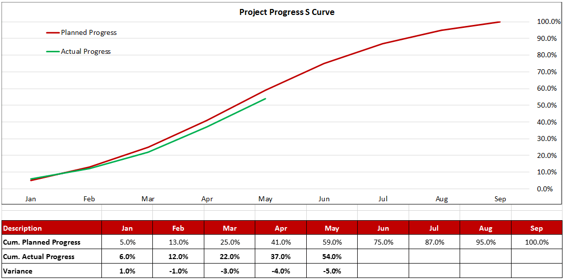
The pictures below illustrate a projects’ typical progress S Curve. Figure-1 can be seen where the actual progress line is above the planned curve with a positive variance of 7.0% (Ahead of Schedule) while Figure-II shows the actual progress curve below the planned curve with a negative variance of 5.0% (Behind Schedule).
Figure 1

Figure 2
S Curve Development Tools
S-Curve can be generated in Primavera P6 from the resource loaded schedule as well as the schedule resource data can be taken out and S Curve could be generated in Microsoft Excel for better and customized graphical formatting.
ScheduleReader is also an important tool in this context and can be used to present primavera S Curves in a better and presentable format for team members as well as executive management.
The software is capable of showing the S-curves for the following data: units and costs.
To apply the s-curves into the Resource Usage Profile view, do the following steps:
- In the Activities Format menu, select the Options feature from the Resource Usage Profile group.
- Select any check-box from the Cumulative column (for example: Budget or Actual).
You will get a plot of the S-curve as shown in the image below.
Types of S-Curves in P6
In Primavera P6, S Curve is plotted for several parameters against the time interval to see the comparison.
These parameters are listed below;
- Labor Units
- Non-Labor Units
- Labor Cost
- Non-Labor Cost
- Material Cost
- Expenses
From the above list, units can be plotted either labor or non-labor at one time however cost can be plotted as an individual or the total of all costs associated with the activities.
Moreover from the above list of parameters, various types of S Curves could be generated in Primavera P6 which are listed below and can be chosen by the project manager and team members to reflect the appropriate one at any given time.
- Baseline Curve
- Budgeted Curve
- Actual Curve
- Remaining Early Curve
- Remaining Late Curve
In addition to the above types, Earned value curves can also be reflected in Primavera P6 which are used for earned value analysis of the project and are mentioned below;
- Planned Value Cost Curve
- Earned Value Cost Curve
- Estimate at Completion Cost Curve
How to Use S-Curves for Monitoring and Reporting Project Progress
An S-curve is a representation of the cost, resource, or any other unit consumed plotted against the time taken. The S-curve can be created for any value you want, depending on the need of the hour. You can plot different S-curves for different values and then compare them to get important information about the project’s life-cycle or the project’s current status. It is an essential tool used by project managers to check the cumulative budget, actual budget, and remaining budget for the project at any given time. It helps in monitoring the success of the project.
The graph is termed “S-curve” because of its nature to form a sort of S. The graph is flat at the start, gets steeper in the middle, and gets flat again at the end. This S-shaped formation of the graph is similar to almost all projects. The resources and costs ramp up at the start, get steady in the middle, and then gradually wind down during the end days.

How to Create an S-Curve in Primavera P6
Although it’s possible to plot an S-curve by hand or manually, it would be a lot of hassle. It would be prone to human errors, calculation errors, or errors in data management. One of the best and most efficient methods would be to use Primavera P6 to create an S-curve.
Primavera P6 has its own standard function of generating S-curves. There are two ways to create S-curves in Primavera:
- Resource Usage
- Tracking View
One of the first things to keep in mind before creating an S-curve in Primavera is that your input data should be complete and correct. Let’s talk about an S-curve with resources or cost against time. Since the S-curve greatly depends upon the cost/resources, your resource data should be accurate.
When you create a resource, the two most important things to keep in mind are the “max unit per time” and the “standard rate.” These factors determine how much work a laborer or machinery can do in a day. Carefully plan all resources to use in a specific activity. After you create all the resources, start assigning them to each activity.
After you properly assign resources to each activity, the software automatically calculates the total cost. The software calculates this by multiplying the “max unit per time” and the “standard rate.” The software calculates the total cost of all activities on its own. Now for the S-curve generation. There are two ways to go about this.
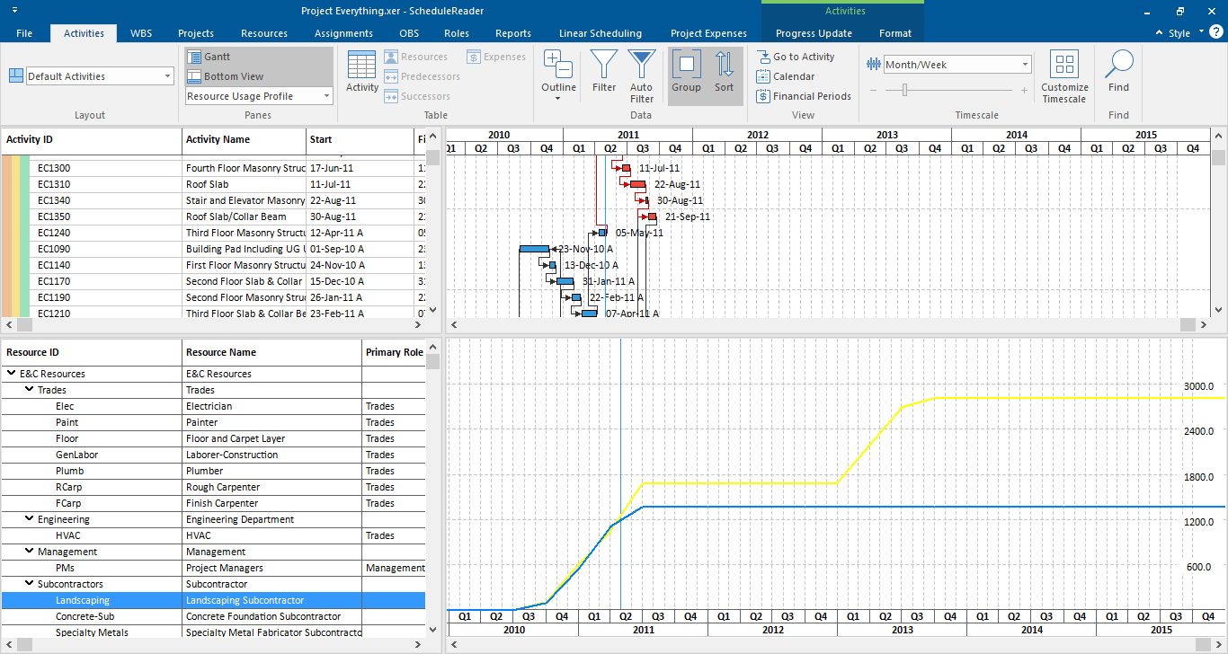
You can view the S-curve through the Resource Usage Profile Bottom Layout. On the top layout bar, there is a button labeled “Resource Usage Profile.”
When you click on the button, a histogram shows up. A histogram differs from an S-curve because it shows periodic data according to the period you have provided it. On the other hand, the S-curve shows cumulative data, and its graph rises at every point, showing the accumulation of resources and cost. To view the S-curve instead of the histogram, right-click on the histogram and select “resource usage profile options.”
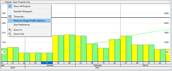
A pop-up menu appears, containing different settings for the resource usage profile. Untick the “By date” option and tick on the “Cumulative” Option. Change the color of the budgeted and actual bars to differentiate between both easily.
The second method to generate an S-curve is through the “Tracking” option. On the topmost toolbar, click on “Enterprise” and then “Tracking.” This option shows us an Aggregated S-Curve of the project.
![]()
The result is as follows:
![]()
So, what’s the difference between both methods? The “Resource Usage Profile” method, by default, shows you what is happening for a single resource. It does not tell you about the entire project as a whole. One resource may be going well for the project, but some other resources may not show favorable results. However, you can hold the Ctrl button and select all the resources individually to show the entire picture.
On the other hand, the “Tracking view” method groups all the resources in a WBS or the entire project and shows them as an Aggregated S-curve.
Monitoring the Project Progress Using the S-Curve
Now that we know how to create an S-curve, why and how do we use it? Before that, let’s discuss the predictability of a project’s progress. Construction projects rarely go in accordance with our plans. The project manager needs to keep track of the changes in the project from the original plan. He has to identify the variations in costs and schedule from the planned cost and schedule. This process is called Monitoring and Control. Even if there are changes in activities outside the critical path, it can affect other activities and create a domino effect.
One of the most common ways to monitor the project is to compare the Actual Performed Progress with the Planned or Baseline schedule. In order to perform this task, you use the project envelope or the S-curve. S-curves are utilized in various Earned Value Management techniques to evaluate the project’s status. The three most important factors to consider in EVM are:
- Planned Value
- Actual Value
- Earned Value
These factors are compared with the planned S-curve to evaluate the current or future status of the project. The results tell you if a project is under budget, over budget, behind schedule, or ahead of schedule. Earned Value Management calculations can be done manually, but it is done automatically in Primavera P6.
Project Managers also use the S-curve to predict or plan cashflows. Cashflows are the inflow and outflow of cash in a project or company during any period of time. Using the S-curve can help determine when there is a need for cash inflow and when the outflow or payment is overdue.
Project Managers often create a planned S-curve using baseline values before the project starts. This allows them to plot the actual S-curve along with it and monitor any changes in the planned schedule.
One of the most important components of the S-curve is its ability to show different possibilities for the project. The S-curve envelope shows you the early schedule curve and the late schedule curve. The early schedule curve shows data according to the early start dates and the late schedule curve shows data according to the late start dates. The project manager can use these curves to see if the project’s S-curve is going inside the envelope or not.
Reporting of S-Curve
Now that you have an S-curve in your hand, you have to formally document it in a report to show it to your superiors or in charge.
So, the next step is to print the S-curve.
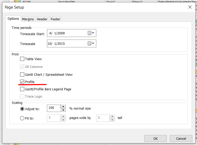
- Click on File and select Page Setup
- In the pop-up dialogue, select the Options menu
- Untick all the options and only select Profile
- The Print Preview option shows you the S-curve. You can print it on any desired page.
The S-curve reporting is a crucial part of the process. Even an accurately drawn S-curve can show the project’s lousy image if not reported or displayed well.
Often, your superior would ask you for more details or changes in the schedule. Printing each variation or detail can be a hassle. On the other hand, not everyone has expertise in Primavera and can load the .xer file. So you cannot simply give him the .xer file either. In this case, the best option is to use a third-party tool like ScheduleReader.
ScheduleReader is a standalone software that you can use to open and read .xer, .xml, and .xls files exported from Primavera P6. It is an independent software, and unlike Primavera P6, you do not have to connect it to any database. This allows people with no expertise in Primavera to quickly open any project schedule on their PCs. It also saves you the trouble of saving a PDF file every time. One of its best advantages is its cost-effectiveness. They provide you with custom licensing options according to your business.
A few uses and benefits of using ScheduleReader for S-curve reporting are:
- The presentation of the S-Curve drastically affects how the project manager perceives the report. E.g., light-colored or less visible lines often confuse people as it makes them wonder what it depicts. ScheduleReader uses vibrant and warm colors to display all stats and progress of your project.
- The S-curve in ScheduleReader shows the entire summary of the project in the shape of graphs. The graphs show the cost used, resources used, cumulative budget, the project’s status, etc. This saves the project manager time of going through different types of reports.
- Through ScheduleReader, the project manager can assess the S-curve of a single resource as well. This lets him evaluate which resources are affecting the S-curve the most.
S-Curves in ScheduleReader
ScheduleReader allows its users to perform a quick analysis of the schedule, apply filters, group activities. It also has the ability to draw S-curves for both Costs and Units.
There are numerous S-curves used in project management, but this software supports the following:
- Man Hours versus Time S-curve
- Cost versus Time S-curve
- Actual S-curve.
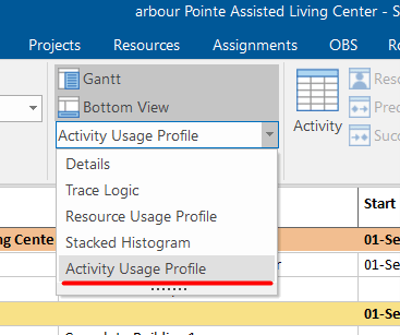
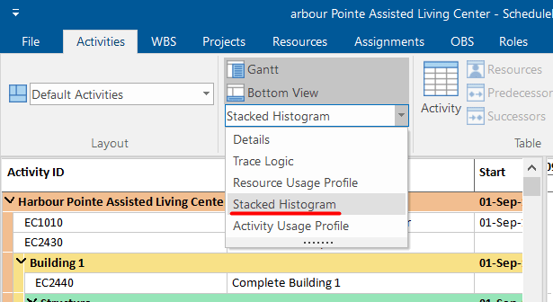
To create S-curves in SchedulerReader, just go to the Activity tab and click on “Bottom View.”
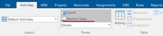
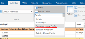
The drop-down menu will show you several options that will appear in the bottom view. These are Trace Logic, Resource Usage Profile, Stacked Histogram, and Activity Usage Profile.
First, we will show the S-curves generated from the Resource Usage Profile. Select the Resource Usage Profile.
Then, in the Activity Format ribbon, choose whether you want to see the s-curves By Resource or By Role.
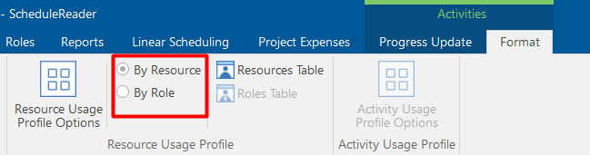
The project plan presented in the examples is created with resources, and because of it, the images that follow will be shown By Resources. The steps are exactly the same as a project plan that includes roles.
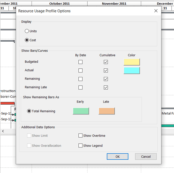
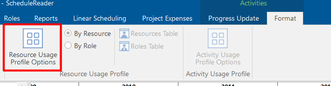
After you have chosen between By Resource or By Role, click on the Resource Usage Profile Option.
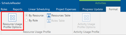
A new dialog pop-up window will open. In this window you may select any check-box from the Cumulative column including Budgeted, Actual, Remaining, and/or Remaining Late. Choose the ones you want to track, and they will appear in the bottom view. An interesting feature in ScheduleReader is that the software allows you to customize the look of the curves by color, and to make combinations of the cumulative curves. Plus, you may add Additional Data such as Legend, Overtime, Overllocation, and/or Limit.
After arranging the fields you need, when you click OK, and the S-curves will appear in the Bottom View like this:
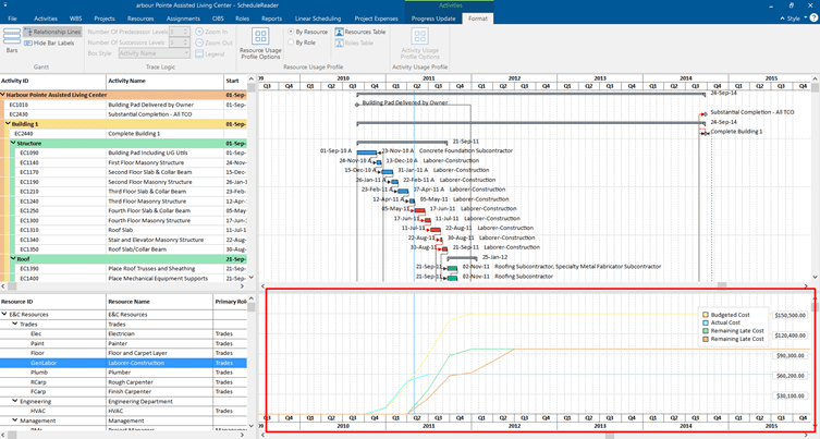
This example presents you with only one way to draw S-curves in ScheduleReader. It shows you only the S-curves for a selected resource.
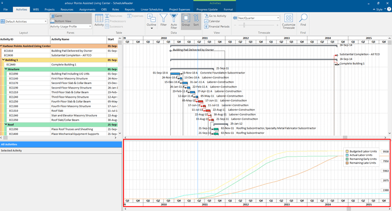
But, if we select the Activity Usage Profile from the Activity tab under the Bottom View, we will get a different view of the S-curves:
This view shows us the S-curves for the entire resources in the project plan.
If we click on the Activity Format ribbon, again we have the possibility to open Activity Usage Profile Options that gives us an extra option from the Resource Usage Profile.
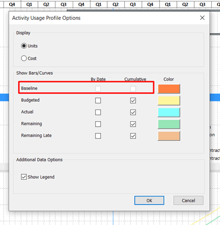
As you can see from the dialog we have the same options to draw S-curves by Units or Costs. The same Cumulative curves are there, but now we have the option to check Baseline. This will allow us to compare the project plans.
Moreover, we can navigate a selected activity and see its S-curves from the Activity Usage Profile in the left chart. See the image below:
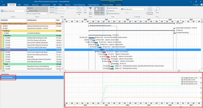
You can choose a specific resource, and in the Bottom View, you will see its S-curves.
The possibility to navigate the S-curves on the Selected Activity and All Activities from the same place allows us to analyze, monitor, track, and report all changes of the project with ease. It will save time, but most importantly we will be able to see every change in the schedule and take the needed actions.
Finally, we have the S-curves in the Stacked Histogram. Users can view the S-curves for each resource separately, or the S-curves for all resources that are assigned to the project plan.
To draw these S-curves, go in the Activity ribbon tab, select the bottom view option, and in the drop-down menu click Stacked Histogram.
Then, click on the Activity Format ribbon, and open the Resource Usage Profile Options.
This dialog will give you many possibilities. You may choose between two parameters At Completion Units or At Completion Cost. Also, you have options to choose how you want to see the bars: with Individual cumulative curves, with No cumulative curve or to see the Total cumulative curve. The curves presented in the Bottom View are the S-curves. It is important to mention that you are able to create your own filters, to choose patterns and colors. You have the ability to customize the look of the bars. For this example, we created two filters:
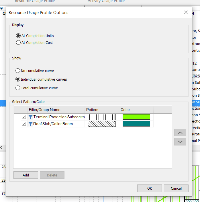
The presentation of the S-curves in Stacked Histogram are shown like this:
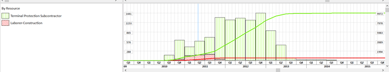
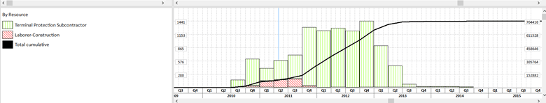
This view shows us the combination of bars and S-curves for two different resources. But, we also have the possibility to see the Total cumulative Curve, by selecting the check-box in the Resource Usage Profile Options dialog. For these filters, the Total Cumulative Curve is shown like this:
One of the benefits of using ScheduleReader is that the software provides the possibility to print out not only the entire plan but also just the Bottom View. In this way, you will get a printed document from the S-curves.
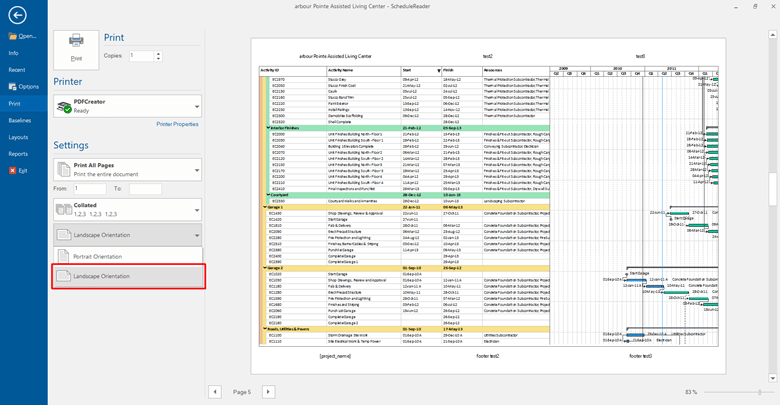
To print out the Bottom View, click File and select Print.
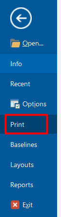
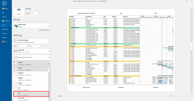
After clicking Print, numerous printing options along with Print Preview will appear. By default, the entire project shows up in the Print Preview. Under Settings, you may specify which pages you want to print out. For a better view and copy, we selected the A4 format and a Landscape Orientation.
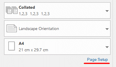
To print out just the Bottom View, select Page Setup.
In this dialog, you can customize the time period, margins, scaling, page header, and footer.
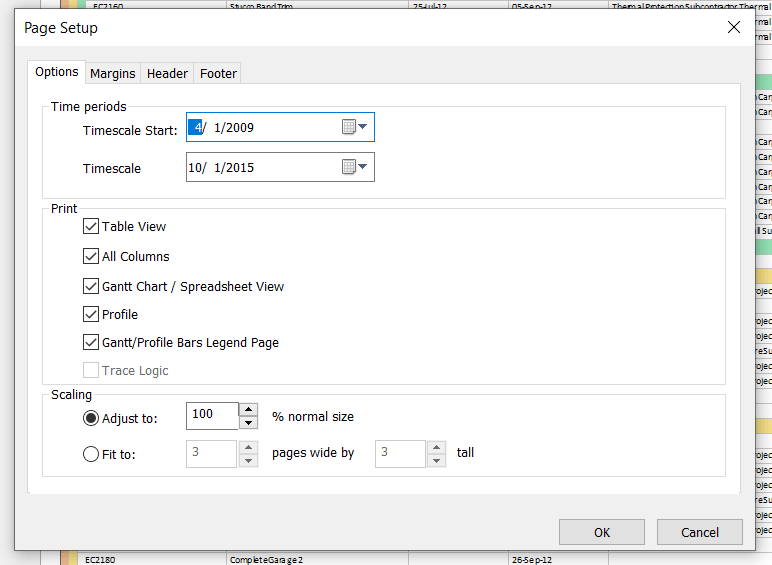
To print out only the Bottom View uncheck the boxes for Table View, All Columns, Gantt Chart/Spreadsheet View, and Gantt/Profile Bars Legend Page. Leave only Profile.
After clicking OK, in the Print Preview section, you will see only the Bottom View. In our case, S-curves in Stacked Histogram are ready to be printed out.
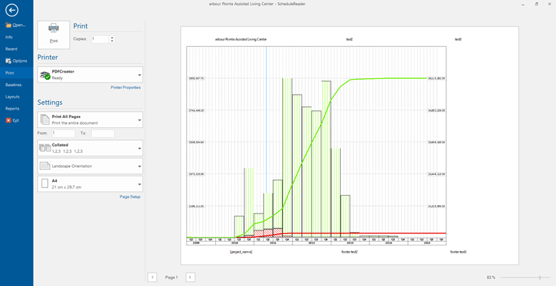
It is important to point out that in this way you get a better view of separate details of the project schedule, plus you save on paper.
Final Thoughts
S Curve is an important and widely used management tool across project management and project control.
It helps the project team and project controls professionals monitor the various forms of performance outputs, identify any cracks and take preventive and corrective control measures to ensure on schedule and under budget completion of projects.
The S Curves of completed projects also become part of the lesson learned document for organizations as guidance for future similar projects.
The S-curve representation and the ability to view variations are much more manageable in ScheduleReader than in Primavera P6. The primary benefit of using this program would be to create a fast-paced environment with smooth communication and coordination between stakeholders. The intuitive and dynamic overview of the project detail and the customization also make you feel comfortable and reduces miscommunications.